Use paint colour to set the mood
Before choosing a paint colour, it helps to ask one simple question: how do you want the space to feel? The right shade can make a space feel calm and relaxing, bright and energising, or warm and welcoming.
Paint colour plays a powerful role in shaping the atmosphere of a room
The right shade can make a space feel calm and relaxing, bright and energising or warm and welcoming.
Thoughtful colour choices can influence how a room feels throughout the day and how comfortably people move through it.
Your home isn’t just a collection of rooms. It’s where you relax after a long day, spend time with family and welcome friends. Before choosing a paint colour, it helps to ask yourself how you want the space to feel. The answer will guide you toward colours that create the mood you want while enhancing the way each room is used.
Use paint colours to set the mood
The power of undertones: warm vs cool colours
When choosing paint colours, undertones can make a surprising difference. Two colours may look similar at first glance but feel completely different once applied to a wall.
Warm hues
Colours with yellow, pink or orange undertones create a softer, more inviting atmosphere. They work well in spaces where you want warmth and comfort, such as living rooms, dining areas and bedrooms.
Cool hues
Colours with blue, green or purple undertones feel crisp and modern. These shades are often well suited to kitchens, bathrooms and contemporary spaces where you want a fresh, clean aesthetic.
Understanding undertones helps ensure colours complement your flooring, furniture and natural light rather than clashing with them.
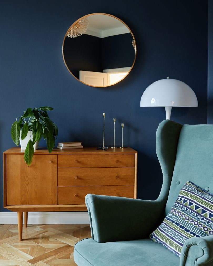
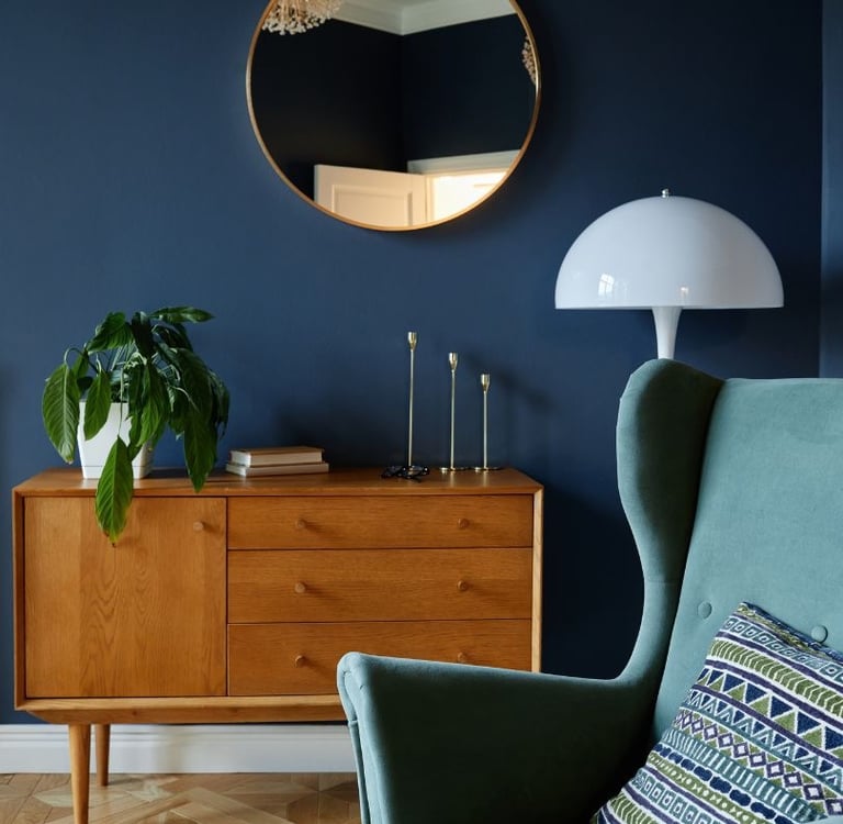
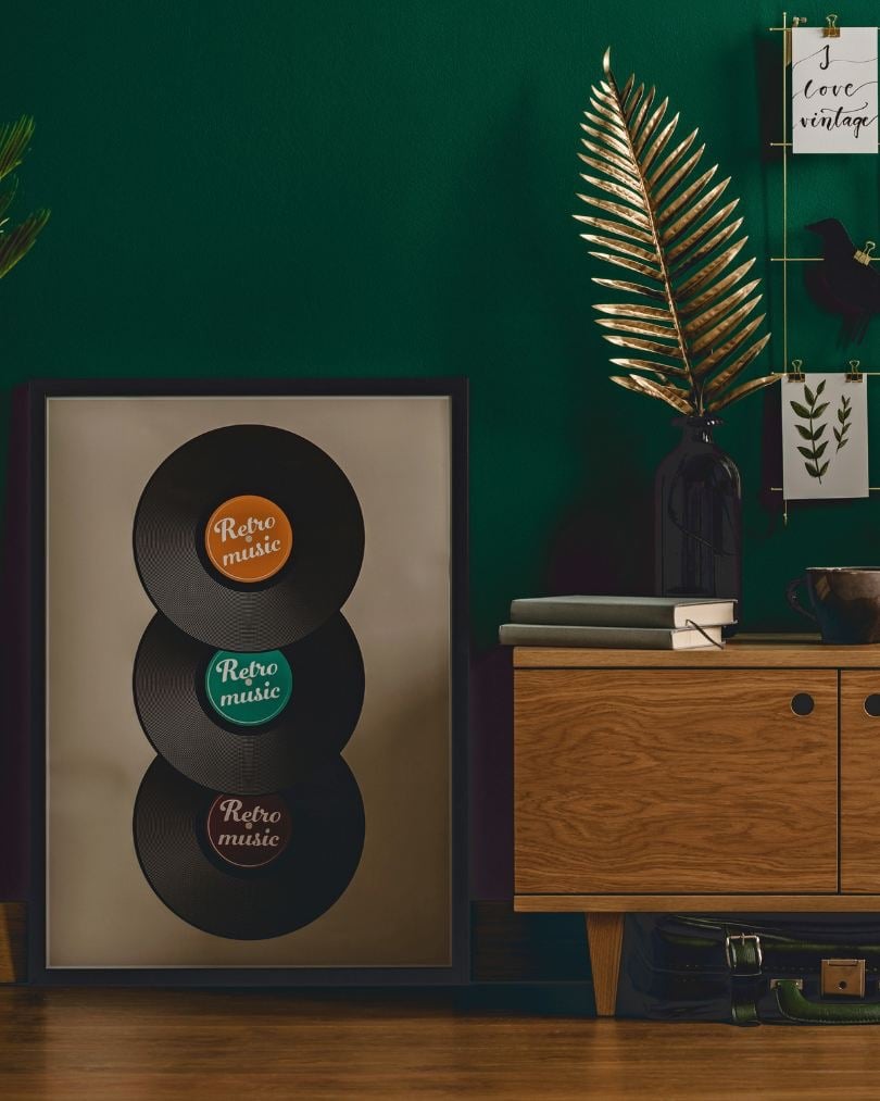
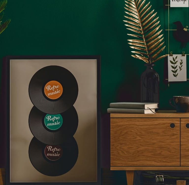
Dark or south-facing rooms: embrace the mood
Not every room is filled with natural light, but darker spaces can still feel beautiful and intentional. Rather than trying to fight the lack of light with stark white walls, leaning into deeper tones can actually make the room feel warmer and more inviting.
Best choices: Charcoal grey, deep green, warm chocolate brown or rich aubergine.
Why? These colours create a cosy, cocoon-like atmosphere that feels designed rather than dim. When paired with layered lighting such as wall sconces, floor lamps or table lamps, darker shades can transform a shadowy space into one that feels comfortable, stylish and full of character.
Dining rooms: depth and atmosphere
Dining rooms are perfect for experimenting with richer colours. Because these spaces are often used for shared meals, celebrations and entertaining, deeper tones can create a sense of warmth, intimacy and sophistication.
Best choices: Deep navy, forest green, warm terracotta or rich wine tones.
Why? Darker shades add depth and character, helping the space feel more intimate and inviting. These colours also pair beautifully with warm lighting, wooden dining tables and metallic accents. When balanced with lighter furniture or artwork, they create a dramatic yet elegant setting that encourages conversation and relaxed dining.
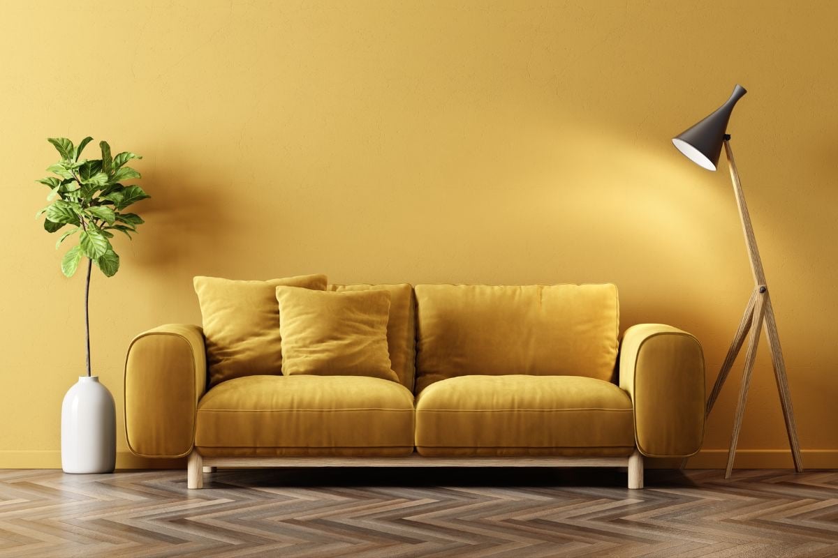
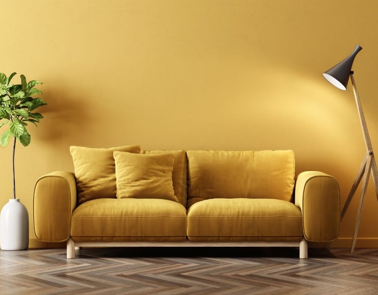
Living areas: warm and welcoming
Your living room is where everyday life unfolds. It’s where families gather for movie nights, friends catch up over coffee, and quiet moments are spent relaxing with a book. Because it’s such a central space in the home, the colours you choose should feel comfortable, welcoming and easy to live with.
Best choices: Soft beige, warm greys, earthy greens or warm neutrals.
Why? These shades create a relaxed atmosphere and work beautifully with natural materials such as timber furniture, woven textures and linen fabrics. They also provide a versatile backdrop that suits a range of interior styles. If your living area receives plenty of natural light, deeper tones like terracotta, olive green or muted mustard can add warmth and visual interest while still feeling sophisticated and balanced.
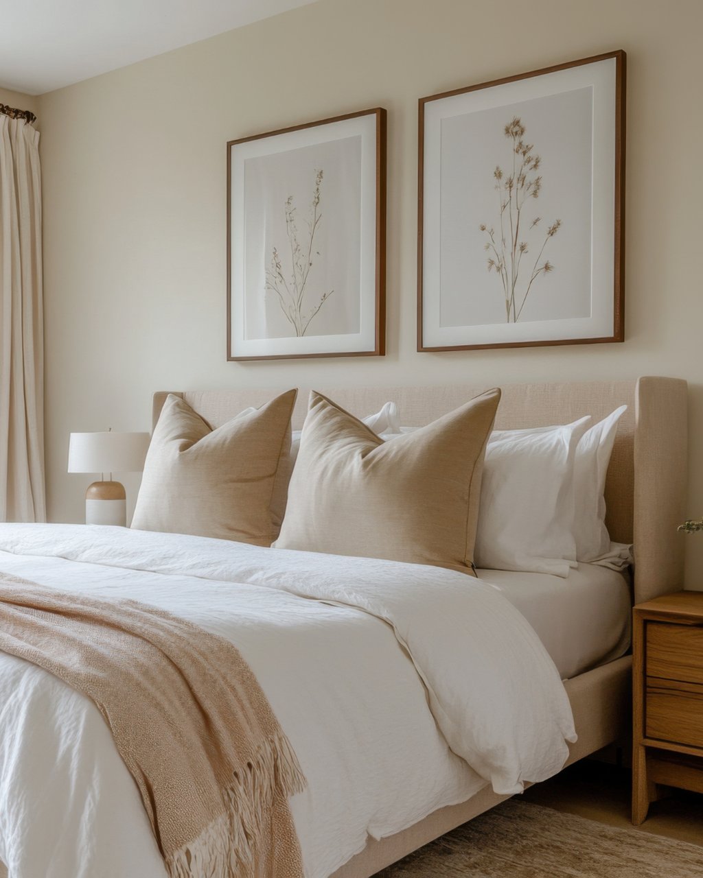
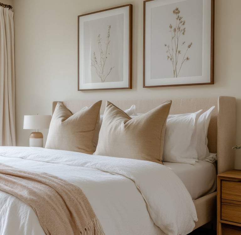
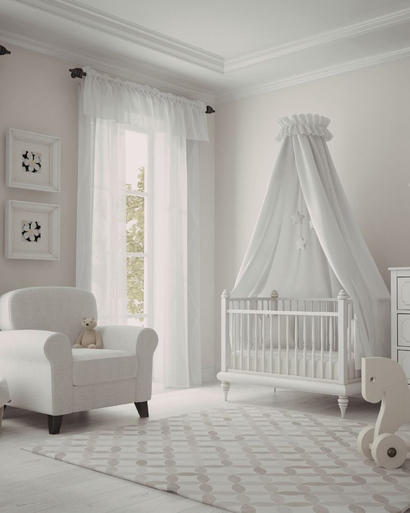
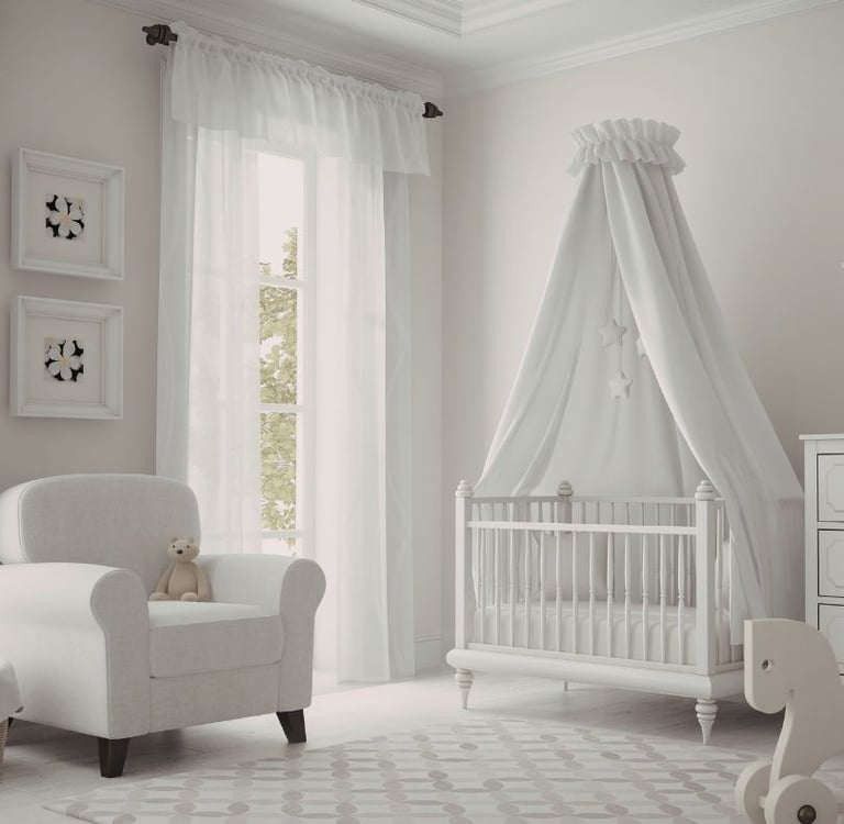
Bedrooms: a sanctuary for rest
Bedrooms should feel calm and restful. After a busy day, this space becomes your personal retreat, so the colours you choose should encourage relaxation and help create a sense of comfort.
Best choices: Soft pastels, dusty blues, gentle greys or muted greens.
Why? Softer colours naturally create a calming effect, which makes them ideal for promoting rest and relaxation. Colours like sage green, powder blue or soft grey feel peaceful without being dull. If you prefer a slightly warmer feel, consider taupe or warm greys that add comfort while still maintaining a tranquil atmosphere.
Make your home your own
Colour is deeply personal. While these guidelines can help create the right mood in each room, the best choice is always one that reflects your style and suits how you use the space.
If you're unsure, testing sample swatches on your walls is a great place to start. Observe how the colours change throughout the day as natural light shifts. This small step can make a big difference in choosing a colour you’ll love long term.
Ready to transform your home with the perfect paint colours?
A professional painter can help you achieve a flawless finish and ensure the final result looks exactly as you imagined. Get in touch with our expert team for colour advice and professional painting services.
Contact Precision Painting & Decorating today for a free, no-obligation assessment and fixed quote.